The probe and directional scanning UI and UX in EVE Online is a core element for a number of gameplay areas including exploration, hunting, and wormhole life to name a few. There have been many feedback threads on scanning across the internet that we’ve been keeping an eye on for some time now.
Inspired by this feedback, we are preparing an update to the scanning UI and UX in hopes of delivering a much better scanning experience.
During the latest CSM summit we got the opportunity to sit down with a number of your elected space politicians and let them get hands on with our changes. It was a really productive session that allowed us to further refine the directions of our planned changes.
The changes will be on a test server at the end of February and releasing with the March release.
Here is a picture from the current scanning system live on our game server Tranquillity:
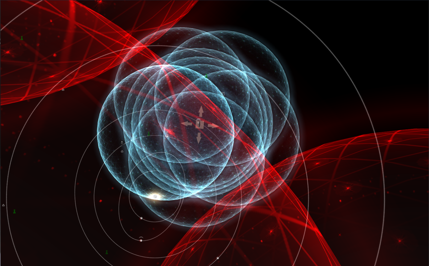
There are lots of things going on in a busy scene and the intensity of some items, and the color of others makes it quite hard to see what you are actually trying to do. This represents some of the biggest areas of feedback as to why people are still using the old scanning system.
To increase visibility of the important items, we have reduced the visual intensity of a number of items in the scene, such as:
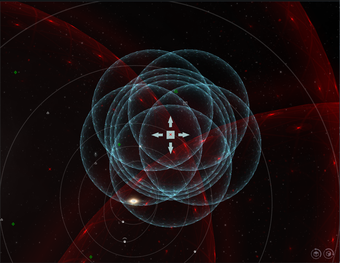
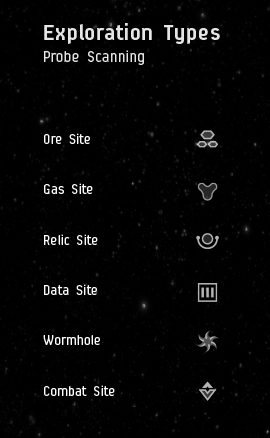
One of the biggest changes we are making to the visibility of probe scanning will be the introduction of icons for each specific site in exploration and the display of the corresponding ship icon in combat scanning. Only when your scan results are at or above 25%, these are only going to be exposed – by then, you already know the according Group.
We are also going to show the progress of the scan in the actual scene when you are scanning specific signatures. When you select a signature in the probe scan window, a circle will appear in the solar system map to show which signature is selected and the progress of the scan. Your selection in the probe scanner window will be maintained in the solar system map.
When a scan completes, the site icons in the scene will animate to their new estimated location, instead of just popping there. We hope this makes it much easier to realize what happened.
We have also added a new colored state to the scan progress to address some defects we had about a signature showing green 100% but still not being warpable.
The color range will now be as follows:
Our aim with all these changes is to improve the overall visibility in the solar system view so it is always clear which signatures you are scanning.
Positioning your probes is kind of a big deal when scanning, so we decided to address some of the pain points that both systems, old and new, have been causing for people.
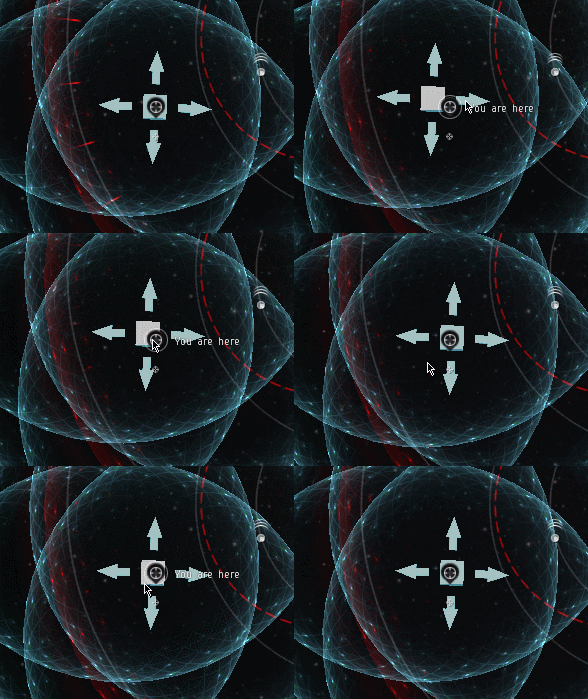
Let’s start with moving your probes. Have you ever had this issue where you want to pick the cube, but a bracket is in the way?
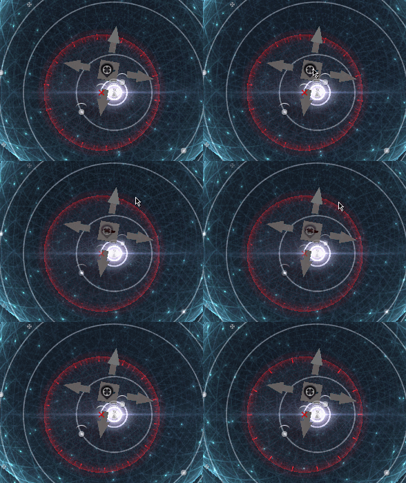
That should no longer be an issue, as the cube should always get the mouse click sent down to it, even through other brackets
What about this one? You want to pick the front of the cube but instead you grab the front arrow.

Problem Solved! We are removing the arrow pointing towards the camera when you reach a certain angle.
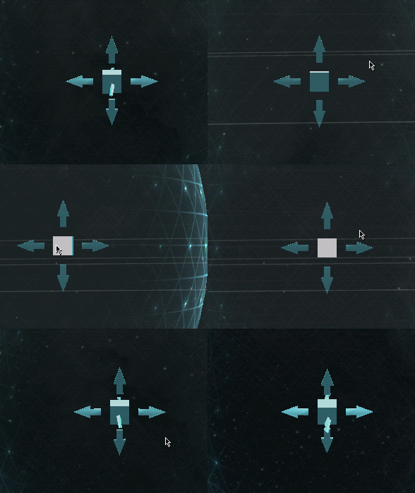
Ever wondered why we let the arrows go flat to a point you could not actually select them? So did we.
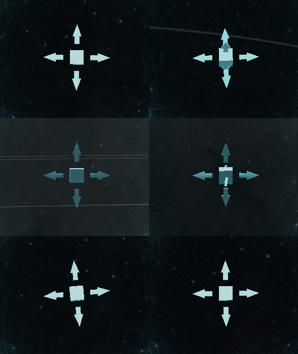
For resizing the probes, we are going to remove the way you click from the edge of the probe spheres and replace it with a slider in the Probe Scanner window. We found the current implementation to not be accurate enough and with other brackets enabled it caused too much opportunity for unintentional item selection.
This means for resizing probes there are 4 available methods:
We are adding 2 buttons to quickly change the camera angle between a top and side view. This will also be bound by default to a double click anywhere in the solar system map that is not a bracket or the probe object.
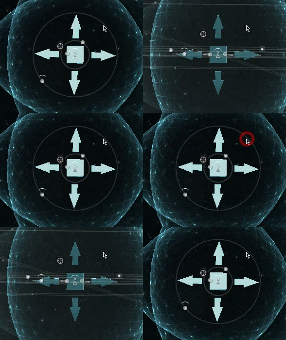
The goal here is to make manipulating probes easy, accessible, and not frustrating.
We are maintaining the window states that were introduced with the “new” scanning system and building on them. You will still have the options for full screen, dock left, dock right, and floating. With the changes you will be to dock the Probe Scanner and Directional Scanner windows within the Solar System map view. You will still be able to open both windows without having the solar system map open.
We have tweaked the layout of the Probe Scanner so everything should flow a little better.
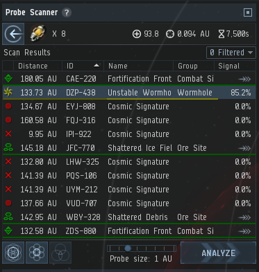
The top section should include all the information about your probes:
The middle section has not changed too much, but we have added the icons in a new column and the new color states.
The bottom section now has the controls for altering the formation of probes, the size of the probes, and the Analyze button. We think this flows better for scanning. Launch formation, change size, analyze, change size, and analyze!
We have hidden the ignored section until you actually ignore a signature.
There will now be some more informative text in the Probe and Directional Scanner windows when there are no results. The probe scanner will tell you if there are no signatures or anomalies in the system, it will also tell you if there are no results being shown because you have filtered or ignored all of them.
As part of the effort to improve the scanning user experience we have added the players Scan Strength, Scan Deviation and Scan Duration to the probe scanner window. These can be seen here
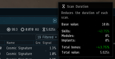
These will show the player's base values taking into account any bonuses they are receiving from Skills, Ships, Modules, Rigs, and Implants.
We hope that by exposing these we can increase a player’s ability to discover how they are able to improve their scanning potential.
As an attempt to improve usability, we’ve introduced the concept of scanning difficulty. This should hopefully help new players understand why they simply cannot pin down a very difficult site, as well as creating a nice reveal moment that can also help with deciding if it’s worth proceeding with the scan or not as difficulty roughly correlates with the value and risk of the site.
Not too much detail on this at the moment because during the CSM playtest the most common question was "What do these things mean?". We took this as a pretty obvious sign we should probably take another stab at how to visualize this.
How do I scan? What is the difference between Probe Scanning and Directional Scanning? What do all the things mean?!?
Hopefully we can answer most of your questions with accurate and informative tooltips added to the Probe Scanner and Directional Scanner windows.
We are adding “?” tooltips to the Probe and Directional Scanner windows. These will include brief descriptions of the purpose and functionality of the two systems including links to the basic items required to perform either action.
For players discovering a data, relic, gas site for the first time and not having a clue what that means, we have added some basic tooltips to each signature in the Probe Scanner that should give a brief description of what each site is and if they require specific modules to interact with.
The directional scanner (aka dscan) is in a pretty good state but there are a couple of issues we have seen in feedback while working on the feature that we are going to resolve.
We’ll be adding a couple UI elements to the Directional Scanner window
We are also working on improving the use and feedback of the scan cone and camera inside the Solar System map.
We noticed with the CSM that when people had the "Align with Camera" option enabled, but then went to do something else and did not realise "Align with Camera" was still enabled it would seem like the camera was broken. We are going to change how this works so when you pan the camera or click on a bracket the "Align with Camera" will be disabled.
The scan cone appearance when "Align with Camera" is enabled has had a little touch up to improve the overall appearance and visibility when using it.
We have changed the color of the directional scan shape from blue to green.
Along with all the changes listed above, we have also been working on cleaning up as many probe and directional scanning related defects as possible.
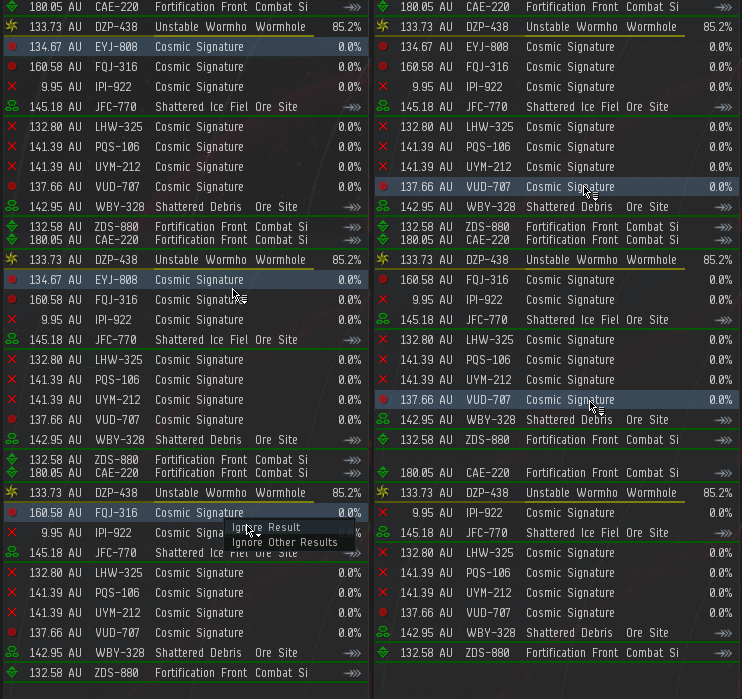
Including this one where you want to ignore a signature but you have another one selected.
In short, the old system is going to be removed when we are happy with the new implementation, but we are committed to this being as soon as possible.
For the initial release we will keep the “old” system in place and replace the current system with a “brand new” system that’s the default for all new players.
Thanks for reading and we look forward to seeing your feedback once we get this in your hands.
Go forth and explore or hunt or both,
Team Psycho Sisters