
On a day when CCP have shown they are willing to listen to the suggestions of the user base when it comes to Citadels, CCP Goliath also announced a series of changes to the scanning map and interface, based upon suggestions in the EVE Online forums, that are now available to test on Singularity.
Heyyyy you guyyys,
So, first off on behalf of Team Psycho Sisters, thanks so much for all of this feedback. We’ve got lots of it from here, reddit, survey, anecdotes, and Corbexx has some more for us too that he’s been gathering through his channels. In the spirit of iteration, we thought we’d share some of the inital changes that have been made to the new interface based on the feedback. Please note that this list, while comprehensive of changes that have already been made, is not indicative of the final shape of the product and we are absolutely looking for an ongoing discussion so that we can deliver a scanning interface we can all be proud of and have fun using.
Before I give you the list though, I wanted to let you know about my own EVE background. I started playing in 2010 and did the oh-so-familiar train-mine-quit cycle. Came back with a friend a few weeks later, hooked up with other friends that had been playing for a while, did some missioning until that got old and then it was off to wormhole space! I’ve lived out of C1-4 holes, never a 5 or 6, since then (barring a brief sojourn into FW, which was fun but lacked the awesome dread that WH space imparts to me – and I’m not talking Moros). I do a ton of scanning, mainly sigs but a fair bit of combat too, so I have a lot of attachment to the scanning system, though who knows – I may use it in totally different ways to many of you. From reading this thread alone, it is clear that scanning styles and use cases vary wildly and that’s one of the reasons it’s so important to the team to have this discourse and iron out discrepancies.
Anyway, enough about me! Here are the changes made so far, in no particular order, based on your feedback. The new interface has been re-enabled again on Singularity, available via Ctrl-Click on the existing Probe Scanner button. Give it another go and let us know how you feel!
– Reverted probe position controls to the old one
– Removed experimental alt-click probe positioning
– Fixed position update on probe markers on init and probe warp
– Tweaked colors of probes and scene, removed starfield
– Added sun marker filter (applies to all new maps)
– Changed appearance and behaviour of probe move/scale controls
– Visibility of scan result in 3D scene reflects selection state of result list
– Decreased min size of probe scan window
– Made standard filters toggleable through 1,2,3,4,5 keys (this only works when the window is active and does not overwrite other bindings, and cannot be rebound)
– Added distance on celesital and scan result markers (applies to map as well)
– Made it possible to scan by hitting RETURN when window has focus
– Added smaller “No probes deployed” hint so its visible if the probes menu is at its min size
– Making ignored result clickable to reset the state, changed icon to X
– Adding help icon explaining probe position modifier keys
– Change Range only accessible while pressing ALT
– Added menu icon on filtered and ignored status texts
– Added support for configurable min height in DockPanelMenu allowing probe menu to be resized to one entry
– Tweaked fadeout distance on bookmark markers (applies to map as well)
– Synced the tooltip delay to inflight-bracket tooltip delay
– Added camera center offset to mapview camera– Fixed spots in 3D scene for planets and moons- cleaned up scan result entry
– Unified probe, intersection, warpline, movement line colors
– Added map backdrop
– Removed probe status in probelist
– Dimmed the starfield
– Polished icons on formation and probe buttons
– Tweaked appearance of menu resize handles
– Tweaked the layout so all controls are in the sidepanel
– Re-enabled the new probe scan window by CTRL-Click probescan button
– Implemented highlight indication on probes and results


A side by side view of the old and new scanning maps
I also had the pleasure of talking to General Stargazer, a well-known explorer, who has previously written wormhole guides and has a lot of experience with scanning. General Stargazer was one of the few people chosen to test the new scanning interface on Singularity.
Me: I had heard you were fortunate enough to test the new scanning interface on Singularity
GS:
Me: S
GS:
We have had the Beta Map
With the old map, w
Me: T
GS:
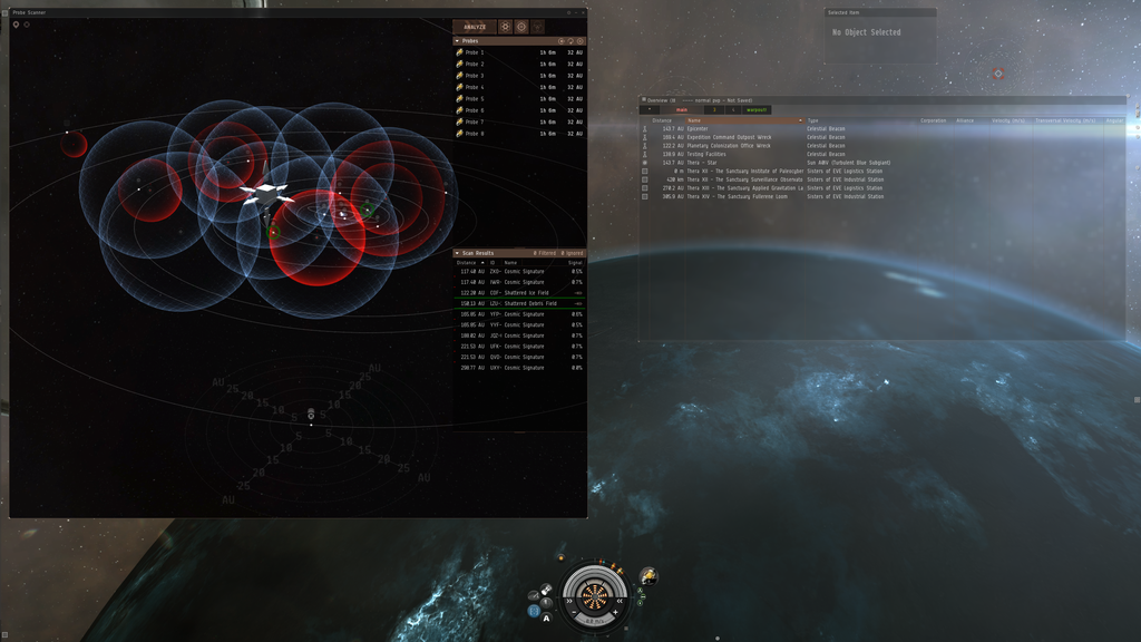
You can see the new scan window in the top left of the screen.
Is your inner explorer satisfied by the proposed changes concerning the scanning map, or are there more changes you would like to see?